CIPDs - A judges view
/ News + views , Awards / Posted by Noel

A few weeks ago I had the pleasure of judging the final stage of the CIPD Recruitment Marketing Awards. One of the most prestigious industry awards, it celebrates creativity and effectiveness in 16 different categories from print and employer brand, through to digital and diversity. All of the work revolves around engaging with the very best talent - be they external or internal.
The big awards event at The Brewery was pretty tip-top (what I can remember of it), but throughout the night I was cornered by a number of friends from other agencies and asked the very same question "Why the &*%£ did that win?"
So, while I won't divulge any sensitive information, I thought it would be a great idea to go through a few of the results that were most contentious and give my opinion (and I stress it is my opinion) on why they took home a gong.
Best Graduate Initiative
As always there were some great entries in this category, and some very big budgets. Syngenta stood out a mile though as it's approach to targeting talented graduates was completely different to all the others. Rather than spend their budget in a traditional way (brochure, website, adverts), they created a movement centered around one of the planets biggest challenges - the shortage of food.
'Thought for food' challenged graduates from around the world to develop wildly innovative projects that would help raise awareness and inspire action towards solving the world's most pressing food issues. The competition was backed up by some really eye catching comms, and a great social media strategy. A clear winner all agreed. You can find out more about it here.
Best Employer brand
This was a category I spent a lot of time going through. Real employer brands are few and far between, and even some of the shortlisted entries fell short in my opinion (no pun intended).
LV= was a really strong contender, with some great ideas and great initiatives. The brand itself has been around for a long time now, giving it chance to come to life and give a great ROI. Probably the best out of all the entries in fact.
But on the flip-side we also had Eat. What I loved about this was that it was so perfectly on brand. Everything from the posters to the website to the social media delivered a consistent and engaging message that spoke directly to the target audience. You could have removed the logo from any of the comms and still known it was from Eat. In fact, the only thing that let it down was the sound quality on the videos - get a sound man next time please!
Suffice to say, it was a very close call in the end, but Eat came home by a salami sandwich.
Best Outdoor
Really difficult one to judge this, mainly because the entries were so different in origin. I loved the JP Morgan entry simply because of the unrivaled impact of the instillation. You couldn't help but marvel at it's beauty, and the effect it had on campus.
Recruitment effectiveness
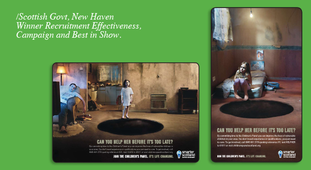
I was looking for great creative thinking, coupled with incredible results. The winner, The Scottish Government, didn't disappoint. Really powerful creative work over a number of different platforms, and results that could not be matched by any of the other entries. Check out some of the videos here.
Best Digital Solution
A hard fought category, with two clear leaders. The KPMG immersive graduate assessment centre (which incidentally picked up best in show at the RADs in January) was a huge favourite of mine, and not because my old Penna creative department were involved in it. For me it was one of the most innovative pieces I'd seen in years, and clearly showed that creative thinking doesn't have to be reserved for attraction campaigns alone.
But, the GCHQ hackers website was a different kettle of fish. I felt it was a bit of a first thought idea in all honesty - we pitched the same idea for the GCHQ tender a few years ago. But, what was truely clever about this gong winner was the way it was promoted. Almost no money was spent on advertising. Instead anonymous articles and links were posted on hacking and programming sites and on twitter. The campaign perfectly targeted the the right kind of people, and was so different it picked up national media attention. Who care's if the problem was solved on the first day and it's answer google-able (well ok, I do a little), GCHQ made national press, raising their profile massively. Finally, hats off to GCHQ themselves. This was a brave thing to do, but as the saying goes 'Fortune favours the brave'.
Best Internal Recruitment Comms
Not the strongest category to be fair, but I liked the Telefonica entry - pity the results were so poor. The winner, Lifestyle Services Group, had some of the worst art direction I saw all day (sorry guys), but it did have one redeeming feature - a smart phone app.
The app gave their employees a simple, easy and very effective way to refer people. So easy in fact that referrals shot through the roof. It's fair to say it's not the prettiest of campaigns, but it was reassuring to see a campaign that didn't centre all of it's communications around posters and a table-toppers.
Best use of video
Now I'm a big one for not giving awards to agencies who have created work for themselves. But I turned a blind eye to this lovely video from JWT. It was created by JWTs graduates to attract next years intake and because of this I couldn't help agree it was a worthy winner - look what you could be doing kids! Check it out here.
Best in-house recruitment team
Won by Sodexo, but the real stand out here for me was the Civil Service Fast Stream Team. Their Facebook page has been set up, created and developed by their in-house team. It's manned by people who are on the Fast Stream and they chat every day with people, answering questions and giving insight as well as collecting a huge number of 'Likes' in a very short period of time. If you want to see great social media in practice look no further than here.
Best Art Direction
I'll try not to be biased on this one, as work I did for MI5 before setting up CA3 was in the running here. I wasn't allowed to judge this category (obviously), but had I been allowed to comment I would have said this of the TFL winner "It is a lovely piece of art direction, but I've seen the idea about 300 million, zillion, trillion times. I have the same ad in my portfolio in fact." Whether that would have persuaded my illustrious judge friends we'll never know.
Best in show
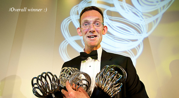
Scottish Government. Creative. Effective. Multi-platform comms strategy. A powerful, compelling, winner. Funny though only sent one bloke from New Haven to collect!
There were of course some other great entries. I myself picked up
a gong for Best Press Advert for my work with MI5 which was a
rather nice surprise (as I wasn't allowed to judge that category so
didn't know the winner!). Pity I wasn't allowed in stage
If you'd like to find out more about the CIPDs, and see more of the winners above (and in the other categories), click here.


0 Comments