A beginner's guide to responsive websites
/ Clever thinking / Posted by Noel

The web industry is constantly evolving. It does this to keep up with advances in technology, and to deliver bigger, better and faster sites that improve the user experience and ROI for clients. One of the biggest new trends to emerge over the past year or so is the concept of responsive web design. If you've not heard of it, or not warmed to the idea yet, it's definitely worth you reading on as it's taken the industry by storm.
So, what is a responsive website?
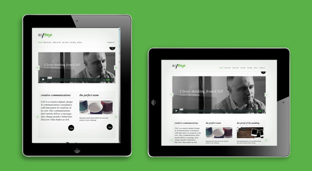
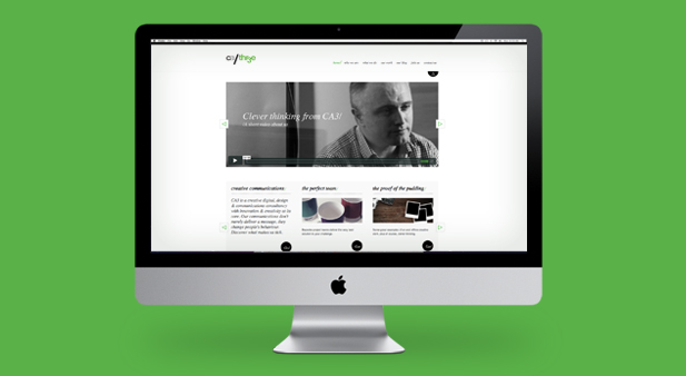
A responsive site changes it's design/layout to better suit the device/platform it is being viewed on. By device we mean smart phone, tablet, laptop, desktop, or even a smart TV. So, if you viewed a responsive website on your laptop computer, then looked at the same site on your iPhone they would look different (you can see how this looks above if you scroll through the images - or just look at our website on another device and see how it changes). The term was coined by it's creator, Ethan Marcotte, who developed the first responsive site with the pioneering Boston Globe News site.
It's important to understand that responsive web design goes much further than look though. A responsive site intuitively provides the user with the best user experience for that device. It takes into account everything from layout, design and copy, to how users browse on a device. For instance, if you are browsing on a smart phone you tend to spend less time on a site. You read less and act more - so less copy and a quick and easy job search on the homepage is key. Users are also less likely to watch video content (although the new 4G services coming soon will change that).
Why should your website be responsive?
Technology is evolving at a frightening rate. A few years ago, you could get away with a straight-forward website backed up by a mobile site, but this is no longer the case. Nowadays we have smartphones, large smartphones, small tablets, tablets, notebooks, mini-laptops, laptops, desktops and smart TV's to name but a few. What's next?
A responsive site means that candidates get the best possible experience when they visit your website - no matter what device they're browsing on - and this improves your ROI. It also provides you with a way of meeting the requirements of every device without having to incur the costs of creating a different version of the site each time.
Now, we'd be lying if we said this kind of website cost the same as a normal one. There's a lot of clever thinking that goes into producing a responsive site by the planners, designers and developers. So it's important to make sure your target audience will indeed be using multiple devices in order to browse your website. But, with new products and devices being introduced to the market every week and candidates expecting to be able to use these new gadgets to engage with your organisation, a tailor-made, responsive experience is definitely something to consider.
0 Comments