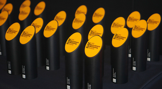
CIPDRMAs - A Judges view
/ News + views , Awards / Posted by Noel

The final round of judging at the CIPDs was held over a full day at Redactives headquarters over in Farringdon. My fellow judges included senior peeps from B&Q, Rolls Royce, CIPD and was overseen my Anthony Moran from Redactive. The whole event was recorded giving Redactive enough material to blackmail us for years to come.
I'm not going to go into every single winner here, but pick out a few I feel need a mention. So with out further ado, we'll kick off with Best Art Direction.
Best Art Direction - Adidas
Quite a bit of discussion here about what good art direction
really was. Being an art director by trade it's been said (once) I
know a little about art direction and I personally loved the
winner. This idea lives and dies by the strength of it's art
direction, felt perfectly on brand and was well targeted. Split
adverts like this are notoriously difficult to do well, but I can't
fault this one. Maximum had a great outdoor advert for Eneco that
used the power of the sun (literally) which everyone loved too, but
in my heart of hearts I felt this was a winner of best outdoor, not
art direction.
Best Press Advert/Best Copy - MI5
Having worked on the MI5 and MI6 accounts I know how hard it is to
be creative, deliver results AND create work that befits the crown.
This does all three. The copy describes the story of a stolen car
through police reports, covert intel and records. It's as real to
life as you can get to doing the job it advertises, meaning it
perfectly targets the right candidate. My only criticism is the
'Terrorist Cell' bolded out. It didn't need it, though I have a
feeling this wasn't put in by a creative. What will be interesting
to see is if Penna, who created the advert, can continue to deliver
award winning work for the security services now they've got rid of
their creative department. Only time will tell.
Recruitment Effectiveness - Deloitte
There were some really effective entries in this category - as
you'd expect - but not that many creative ones. The Deloitte entry
cleverly wove on-campus marketing with social media, producing
great results and more than a few dodgy charactertures. On the Deloitte Facebook
page students could tag their illustrations and the one that
received the most 'Likes' won a prize. The winner had over 4000
Likes. There are some global company pages that have less Likes.
Great job.
Best use of Social Media - Office for National
Statistics
A personal favourite of mine, this campaign demonstrated that
social media isn't just resigned to graduate campaigns. The
campaign, which used Facebook, Twitter and blogs to create a real
online buzz, was to recruit a Deputy Director of Digital
Publishing. But, rather than simply post the job spec online, they
built a community of followers through intriguing, interesting and
engaging posts and tweets. When that community was truly engaged
with, the role was revealed. Five of the six shortlisted candidates
came from social media. Brave client. Great win for the
industry.
Best recruitment website - LV=
Some really strong entries here as you'd expect, but the winner
stood out from the off. The LV= site has been around
for a few years now, but every year it's updated and improved.
Content is refreshed and new technology embraced. How many other
companies can say the same thing - how long have you used the same
profile videos for? The LV= site was strong on brand and content,
and easy to navigate around. The mobile version was the icing on
the cake.
Campaign of the year - The Army
A lot of people will have seen this flash up on the screen and
said 'Well if we had that budget'. But the Territorial Army
campaign, that used live streaming reports from the front line
in Afghanistan to change the perception of them as 'weekend
warriors' as surprisingly cost effective. True, the media budget
was sizeable, but what made it a winner in my opinion was the idea
itself. Simple, effective and memorable. The results were just as
good.
Grand Prix - Mars
Picking a winner here was a reasonably easy decision in the end.
While the Mars Tweetshop
only picked up one gong on the night (prior to this one), it was
second place in a number of categories. The tweet-fueled vending
machine worked wonders with graduates, but was just as successful
at re-educating their own employees as it toured campuses and
factories up and down the country. It helped change perceptions of
Mars (we do more than chocolate) and was pretty brave (not everyone
was happy with their 'f-ing jar of Dolmio' and told Mars online). A
worthy winner for Mars and a great success for Tonic. Small
agencies rock. We should know.

2 Comments
Dan Turner said...
RE the last two sentences on 'Best Copy: Ooh, you are awful!
View all posts commented on by Dan Turner
Noel Thomas said...
Ha ha. Thanks for the comment Dan, though we certainly weren't trying to be awful. There's been a lot of industry change over the last few years, and Penna have obviously decided a freelance model better suits their needs at the moment. As the post states though, we wonder if they will manage to deliver the same standard of creative work now that the team responsible for all those awards have moved on to pastures new. That said, I'm sure Pete will ensure his ship stays ship shape.
Website: http://www.cathree.com
View all posts commented on by Noel Thomas