CA3 Win Best Website at CIPDRMAs
/ News + views , Awards / Posted by Noel

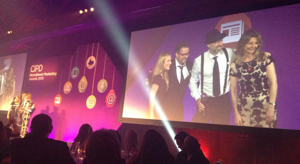
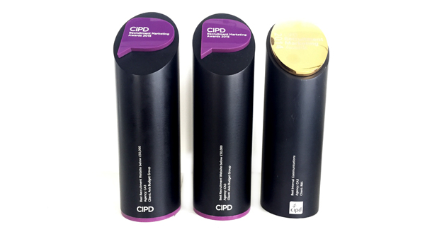
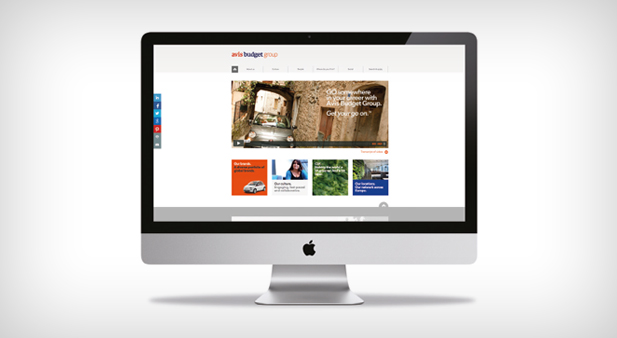
On the 15th July we were lucky enough to win our second CIPDRMA award, for our fantastic client Avis Budget Group (ABG). We say fantastic, because it really was a joint effort in creating the award-winning site.
Anyone who's been involved in creating a careers website recently will know a huge amount of time and effort goes into producing them. Before you start the designs you have the site map planning, content analysis and gathering. Responsive wireframes allow testing of all the critical aspects of the site, such as navigation, page layout, content hierachies and features. And, indepth discussions with ATS providers about job feeds and integration protocols can take weeks on their own. All this before you get to see what the end product might actually look like.
But, just like painting a room, it's this kind of preparation that we feel ensures a great end product.
That way, there's no scary moments, no project creep, no changes to the cost of the site or creatives throwing their toys out of the pram (not that you'll catch any of ours doing that ;)
When you do finally begin the design of the site, crafting each and every element, it's a joy to see it come to life with compelling copy, engaging videos, impactful imagery and everything else in between. All of these elements can't come together though unless both client and agency are working towards the same goal - to produce a stonkingly good site. And that's ultimately what happened with the ABG site.
So, if we attempt to evaluate this site (without being big headed), these are the things we like:
• It's on brand, which it needed to be as not many people have heard of ABG, just their consumer brands. It also looks pretty fab. A great looking site ensures people stay longer.
• It's got great navigation. You can always find what you're looking for easily. A robust site map, created right at the start of the project, helped this.
• It's got great content, not lots of content. Just enough to help candidates make an informed decision about applying. The copy's light and video content is heavily used throughout the site. It's got a surfing dog!
• It gets people to apply for jobs. Jobs are defined by roles, location and business areas, so if you're looking at the Barcelona page, you'll see jobs in Barcelona. It's not rocket science, but you'd be surprised how many sites miss little touches like this, and the results speak for themselves.
• It's responsive. Not only does it change it's design to suit tablets and phones, but it even delivers content differently.
• It makes it easy to share content & has a whole area dedicated to ABG's social feeds encouraging candidates to get involved.
• The link to the ATS is seamless, and you can register using social media, making it very easy to apply.
• It's got great SEO. Google is its best friend.
Take a look at your own site and see how many of these you can say 'Yes' to. If it's all of them, that's brilliant. If not, why not give us a call. You can also find out more about the ABG website here.


0 Comments